
Show
place, win

Win, Place or Show (1998) is a lesser known two-channel video work by one of my favorite artists, Stan Douglas. I used to show it to my students when I taught more hands-on about editing. Douglas made this piece during a period when from what I know he was experimenting with computer-generated editing operations. So he’d film with multiple cameras and use what was then very complex technology to have the edits generated at random. If I recall, I taught around this to ask my students to consider ways of getting out of preconceived notions of time in editing and to help them understand to some degree how to shoot for continuity. Given that I was not teaching in film schools but in liberal arts colleges and art schools, this kind of rules-based filming only occasionally landed well. But it was always interesting to discuss Douglas’s work with them.
You can watch a low-quality version of Win Place or Show on Ubuweb, keeping in mind it’s a dubbed video copy put online a long time ago, and it’s a representation of a video installation and this representation is certainly not how the piece looked in an exhibition context. But that’s what’s there. I haven’t seen the piece in a space.
Here’s the description:
The title of the work refers to the classic horse-race betting options - a subject that features in the content of the two protagonists' dialogues, but also alludes to the combinatorial analysis of race finishes and combinations. Planning feasibility and control are two of the ideological components that also featured in modernist town planning after the war.
Donny and Bob, the two protagonists in the scene, are temporarily sharing this one-person flat. They correspond with the stereotypes in a TV series that was produced in Vancouver in 1968, and represent typical white working-class males of that period. The action scenes lead from discussions about conspiracy theory and the chances of betting wins to conclude with a fight between the two men. They are shot from 2 x 10 camera positions. The acted scene is repeated in a loop on two inclined screens set up next to each other with a small gap between them, but the actors positions in relation to the space and each other constantly shift from repeat to repeat. The 2 x 10 camera shots were transferred to two DVDs. These are digitally controlled to show new combinations within the scene as acted, which lasted six minutes. This would mean a projected playing time of about 20,000 hours, over two years, before any one combination of images was actually repeated.
Under the images is a soundtrack of endless rain and a radio that can be heard in the distance. The sound of the rain is linked in the film with a single view from the window of the apartment. This occurs regularly but not uniformly, and shows a panorama of the city at night in pouring rain. The town buildings reflect a modernistic planning model that also features in the set, producing the typical working-class home such planning would create. The quiet radio noise that is just audible in the background seems to be emanating from a radio on a chest of drawers, though the radio sound is actually fed in from the regional radio station of the current exhibition venue.
It’s a strange piece, specific to a Canadian context that I did not know much about. I would show these together with some of Douglas’s Television Spots and Monodramas and also the video documentation of his Suspiria, which was in the 2003 Documenta. I didn’t see it there, so only knew it from the documentation. I like imagining this piece in its spatial form, that fact the backdrop was a live feed into another space (which relates to Win Place or Show’s use of regional radio transmissions into the installation). I like that the characters are contemporary, and acting in a oddly stilted way, reciting texts mashed together from different sources (in this case, Brothers Grimm and Marx) and the cutting is randomly generated. Visually, I enjoy how the characters’ images are separated in color video and Douglas’s interest in making reference to how Technicolor worked. It sounds super complicated but it doesn’t feel that way.
I like how in Douglas’s early work he teases apart media technologies with intent and clarity, and how texts often collide or stretch to evoke and make his points in ways that are not overt but not so subtle that you can’t figure out at least some of what he is trying to say. As I mentioned already, I like the ghostly quality of Suspiria, and his two-projection 16mm piece Der Sandmann, (the E.T.A. Hoffmann story is also an all-time favorite of mine) and the way he uses early video interlacing in a conceptual way together with overlapping, self-interrupting, and occasionally synchronized audio in Nu*tka. The work gets more elaborate later and the last video installation of his I brought my students to was his 2016 six-channel piece The Secret Agent based on the Conrad novel and set in 1970s Portugal just prior to the end of that country’s dictatorship. I learn from all his work.
Why am I writing all this. Because show makes me think of Win, Place, or Show and I wanted this post to follow those lines. I wanted to talk about my recent show in Oslo and then move on to Place and then end cleverly with Win. Right now I don’t feel like ending anything on a positive note, despite all my recent “wins,” so to speak, but I can jump in to writing about the show and see how it goes.
Show:
My final exhibition for the PhD at the Oslo National Academy of Art, titled Eureka, is up now at a venue called Atelier Nord. I feel fortunate that the gallery said yes to my email inquiry to do the show there. I was interested in Atelier Nord in particular because it is the gallery dedicated to contemporary media art in Oslo and had shown a short video in a 2023 group show there. When telling people about Atelier Nord I said it’s kind of like NYC’s The Kitchen—of Oslo. I was delighted that the new director, Ruth Hege Halstensen, got back to me right away. We had coffee and talked about what I hoped to do and show and we had a great and energetic conversation. Over the subsequent months, Ruth Hege went out of her way to make the exhibition possible. For this I am grateful.
I had worked like crazy to get the films finished, knowing that in my world I have to start early because I don’t have budgets or producers or staff or the like. So I always have to give myself a lot of extra time to make and complete films. In November I got in touch with the Film/Video Studio at the Wexner, at OSU in Columbus Ohio. In the early 2000s I went there, stayed in a little apartment on campus, and made countless versions of edits of a film I think turned out to be Perseverance & How to Develop It. Could be wrong about that one. Anyway, during Covid lockdown they generously offered me a digital residency to do the sound mix for BUNKER.
So I sent the Film/Video Studio an email asking if I could do the sound mixes with them again. I thought for sure it was too last minute and they’d have no space in their schedule to mix three pieces (the other two are silent). By chance they had time and Paul Hill did a fantastic job with those three films (Letter, A Landing, and the two-channel Experiments (BEXUS)). All five films got finished—early.
My primary goal with the show was to have people watch the films. To view them as individual pieces and to understand these films in relation to each other in the exhibition context. I was very clear and sure that this was not meant to be an immersive video installation. I like immersive, but it was definitely not that. And I am super tired of going to museums where even though the artist meant for the film to be watched as a film, the piece is treated like a moving backdrop, often projected in a huge scale that dilutes its power, or the film in a space with lots of light everywhere, and rear-projection screens hung super high up so the film can be seen from both sides, as glance-by “context” for whatever the real art is that is hanging on the walls or in vitrines, carefully installed at standard viewing height for proper reverential contemplation. Not naming institutional names, but you’ve seen what I mean.
The show was on. It was happening. The films were done. At the same time, I was contending with part of exhibition-making I find the most challenging of all: place.
Place:
When I got into the gallery for a site visit I was astonished at how complicated it was. Atelier Nord is in a former church; half the ceiling is open except for a very elaborately designed set of walkways for artists whose studios are above. There are shiny metal dropdown lights peppering the ceiling and the place can’t be darkened entirely. There are columns and half walls and a bunch of windows and doors. I freaked out. In the case of this place, like with the films, many people helped me figure out how to work in this complicated environment, effectively one large room with a lot of visual activity going on, even without any art in it.
One room. No walls. I have five films and a photograph to show. And I do not have a lot of spatial skills or experience building anything to know what is possible or not. When I see other artists’ films in a museum, I often notice how they build out another wall or place it at an angle, or do something interesting to the floor, and I like it. But in my fixed notions around my own shows I often think: why do that when there’s a wall already there. I usually want to screen my films in the simplest way possible, to give the viewer space to come in and see it and not get caught up in other questions. In the past, I simply didn’t feel a need to add to or adjust the architecture.
With film and video work in a gallery or museum the number of ways to present it feels infinite. You can have little screens, ipads, projections, flatscreen or square monitors, you can have front-projection, rear-projection, ceiling or floor projection, horizontal, vertical, video walls, or you can have the damn films beamed into peoples’ devices. There is no standard for film in a non-theatrical space. This is sometimes great and often overwhelming.
And then there’s light and sound bleed to consider. Sound bleed is when you hear sound from one film while trying to watch another and the soundtracks mingle. Light washes out projections. In the past, exhibitions and art fairs showing a lot of films often constructed a bunch of black box viewing spaces, each an imperfect attempt at a mini cinema. These felt stifling and viewers got impatient, knowing there were a bunch of other black boxes they were supposed to enter and manage (visually, temporally, sonically, affectively). These days there’s more of a trend to move back and forth with open screening spaces, combining them with monitors of various kinds. But moving images in a museum setting still pose a lot of challenges. In organizing the space for my show, I tried to think of sound, light, and scale as much as possible, also with the help and input of many people.
In conversations and presentations of works in progress over the past year, I learned that, despite my initial concern that my two-channel film Experiments was just that, the piece resonated with viewers. While editing Experiments, I grew to have confidence in it, even though it doesn’t “look like” a lot of my other works. But every time I watched through, checking a cut’s difference between one frame or another, I felt fond of the piece. And I didn’t think it was just because I had filmed it myself and experienced the activities of the scientists in Kiruna with them. There’s something in the material, or the way I filmed or constructed the edit, that is patient, observant, funny, and empathetic.
I had to learn to trust that my instinct to show the piece as a two-channel video, projected large, was right. And that the simplest explanation might be sufficient. So Experiments (BEXUS 32/33), is projected on a wall I had the gallery build in the center of the space. The wall is at an angle but mostly faces what used to be the church altar. The first thing I knew about the gallery as former church was that many people used the former altar wall as the main space for projection. It was logical, it was the only relatively uninterrupted wall surface, and there was a huge retractable screen on the ceiling you could pull down to project on. It was easy.
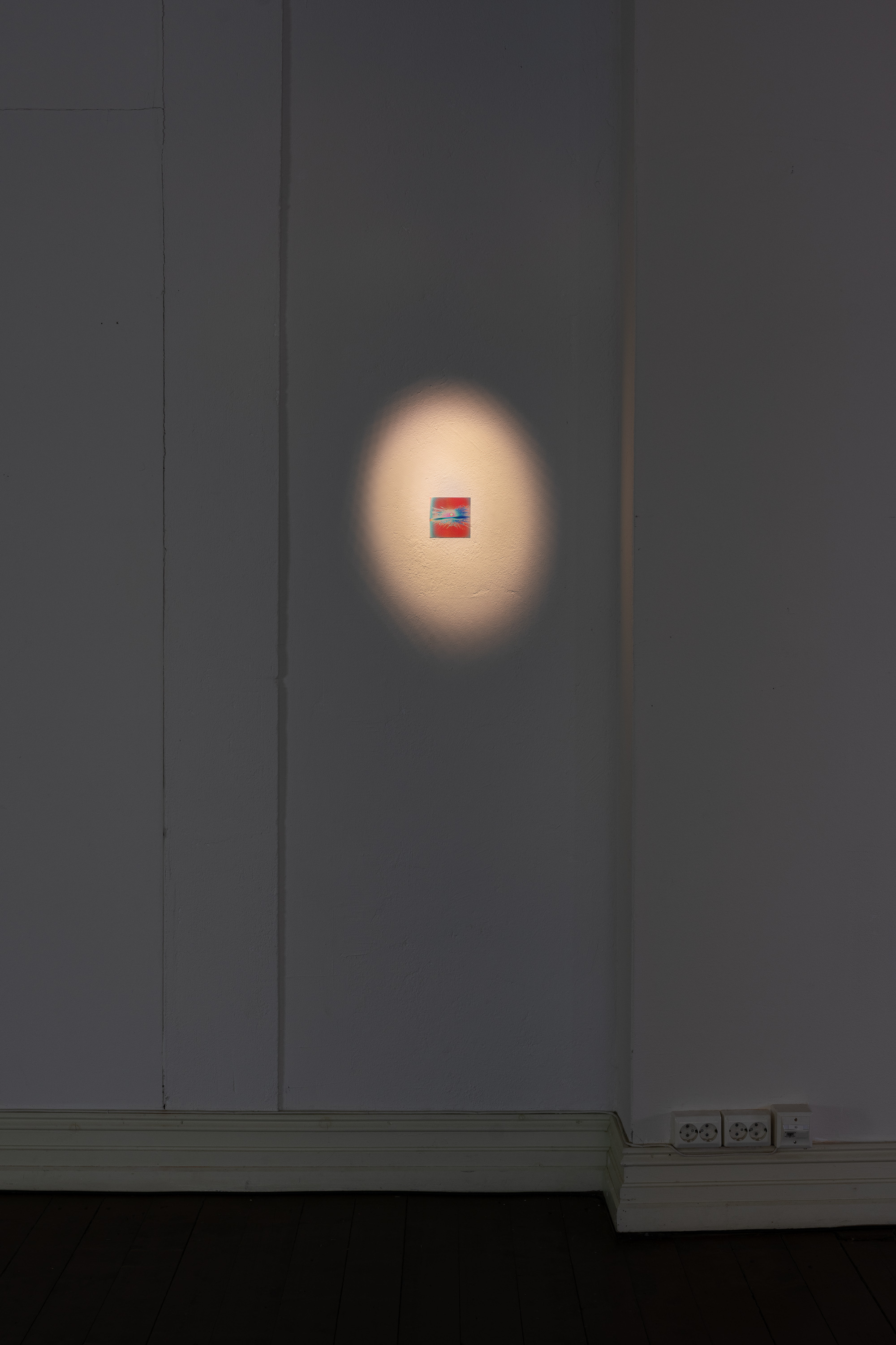
For me, as soon as I saw the space and the floorplan, I felt a strong desire to deemphasize the altar, or to confuse the goal-like orientation built into the architecture. Instead of projecting the two-channel piece there, which would have been the logical thing to do. I placed the solargraph Lumière I received from my homemade pinhole camera that had traveled on a balloon to the stratosphere and back, slightly off center, on the wall.
In the show, the Lumière image is very small, only about 3 inches square. It’s the little tiny thing nobody pays attention to but it is the answer to all the questions, my questions, the questions the works bring into the space and to each other and to the viewer. Lumière is unframed, adhered directly to the uneven wall surface. It’s innocuous, illuminated by a single small spotlight. It’s the only stillness in the exhibition. It laughs at the other works that are all striving so hard to do things, to tell stories, to make working work. It also isn’t doing anything human at all. It’s simply itself and doesn’t have to explain or justify.
All the work in the show, like Lumière, is placed at the center eye level for someone my height. Which is 5 foot 2 (157cm) and shrinking. Not standard exhibition height.
I have spent so many years craning my neck or feeling off kilter in exhibition spaces with their standard exhibition heights. Putting the center at my level places my body into the room and my hope is that it continues to subtly push back against the rules of “invisible” exhibition design. I remember gleaning some of this from seeing pictures of Mel Bochner’s early conceptual work, and strangely enough from getting lost inside Lee Bontecou’s work and also from the pleasure of wondering and wandering around Robert Smithson’s mirror pieces or for whatever reason Barry Le Va’s scatter pieces. I’ve also been thinking a lot about Dan Graham these days too, though I can’t put a finger on exactly why. Something’s brewing.
So Experiments wanted to be big in the space. The films made more for reading (Letter and A Landing, ie with text-driven storylines embedded in the material itself) needed to be smaller so people could sit and read them. Their audio tracks were mostly ambient, so headphones could work. The features of the space determined this as much as I did. It was not possible to project all the films because of the equipment the gallery had and though their technician could do just about anything, he was concerned that with too many projections the beams would start interfering with each other. This is also a low-budget space so it wasn’t like they had access to every kind of high end technology.
At this point, based on experience, I think the fewer video projections in a space the better. Each projector is different, and even if you color correct the hell out of your film, some projectors make them look like bad reality TV. Monitors do too but these pieces looked better on the monitors the gallery had, especially because some of the works were in the 4:3 aspect ratio and they had fabulous square monitors to use.
I spent a lot of time in the space adjusting saturation, contrast, brightness, and color levels, to match how I had remembered the colors looking and had experienced them while editing. All these films were edited on the very laptop I am writing this on, a 15” MacBook Pro. I probably could upgrade my professional world a lot more for not much money, but I stubbornly stick to the idea that I am a scrappy experimental filmmaker who doesn’t need fancy equipment.
What would be the place for Airopaidia and The Wonder in this place? During the installation, I kept saying I wanted Airopaidia to be “like candy.” The film needed to pull the viewer from the entrance straight into the gallery. So we put it on a smallish square monitor on a pedestal and it was the first thing you saw when you came in. That film is bright and colorful and slightly delirious. If you watch all of it, you sense the narrative of the book it’s based on (Thomas Baldwin’s 1783 Airopaidia) but story is not so important. The colors get in the way of the words and vice versa. I wanted you to feel like I imagined Baldwin felt getting all disoriented, happy, overwhelmed, and busy in the sky, and I wanted to express how much I loved the book.
When you enter the exhibition, in the corner, also visible when you’re sitting watching Experiments, is The Wonder, which I showed as a very large two-sided projection on translucent fabric for my last show in Oslo. In this show, The Wonder is on a moderately-sized 16:9 flatscreen monitor attached to a kind of ugly tripod. On the screen, it looks like nothing’s happening and then, most of the time you just miss the launch. That’s part of the point. It’s an awkward object in a corner whose architecture is jammed with crossing lines. I joked that The Wonder in this exhibition is my Malevich. Balloon’s in the corner, there when you come in, there when you leave. You acknowledge it, it sits and does its launches. You ignore it, same.
On places to sit: my friend Angeliki’s architect husband (and now also my friend) Jonas patiently heard me out with all my configurations of the space and then, as generous as you can imagine, designed and built the seating for the show. I wanted everyone to be sitting on stools that looked a little like the boxes the scientists in Experiments were constructing. So when you’re watching boxes, you’re sitting on one too. In making individual seating, I also wanted people to be able to move their own box if they wanted to. I also wanted to acknowledge that some people might want to sit for longer or shorter times and that negotiation can feel awkward when you’re sitting on a long bench together with others. At least it does for me.
Win:
One of my literary heroes, Lydia Davis, was the guest presenter at the final GIDEST fellowship meeting at The New School, just a couple of days before I went to Oslo to install the exhibition. I had the pleasure of being a GIDEST fellow this past academic year, and had presented my work two weeks prior.
Davis provided the group with a work in progress, her rendition of a series of found texts written by one of her distant relatives. This sea captain had written a diary and logs as he and his crew sailed from Calcutta back to the United States. I was first struck by the coincidence of having just nearly finished my written reflection for the PhD, which is almost entirely comprised of my own “logs” (which is what I ended up calling a selection of these very Substack essays, contextualized and reorganized as part of the submitted writing).
But something else Davis said stuck with me. She was answering a simple question, describing how she got started with this new project. Davis mentioned that when she got interested in something she just jumped right in without too much thought, and that she worked it out as she went along. Someone asked a follow-up about her (amazing) translation of Proust’s Remembrance of Things Past: how did she organize herself or the text for translation. Her answer astonished me. She said she didn’t even read ahead in the French. She just went page by page, translating and figuring it out as she read, because she wanted to keep being surprised. There’s a wonderful long essay by Davis about the process of translating Proust where she also says this. You can read it here if you like.
It’s a liberating feeling when an author (or artist) you revere describes a working method that you feel in some way resembles your own. I know I talk often about finding permission in other artists and writers for what I do. You can psychologize that all you want. You could also call it relating, or connection, or recognition, or simply a surprising delight. These secret spaces of making, the inexplicable attempt and forging ahead for no good reason, the enjoyment of the surprise. That is how it works when it works best. Hearing Davis say this (or what I’ve paraphrased) in such a confident, matter-of-fact tone, gave me a lot more fuel to present the five films and one photograph in the exhibition now up for just about two more weeks in Oslo.
The true win, however, was at the opening. My mom came, and so many wonderful friends and colleagues also came to see all this stuff I’d been talking about and thinking about and making over the past three years. I was astonished to realize how much of a community I’d managed to develop even while not being able to be in Oslo full time. I felt so much gratitude and joy at having met so many new and lovely, kind, generous and supportive people. That’s a different kind of sustenance and entirely distinct from who comes in first at the horse race.
I might write more another time about the show and the writing and how this all continues. Part of me thinks this long essay is too much and wants to simply make short pithy statements and present installation images for your delight. I also want to write about the oddly obsessive joy of proofreading, something I completed on my own written reflection text prior to submitting it last Thursday. But that might be even more weedy for anyone to struggle through.
This morning the doctoral committee visited the exhibition as part of their assessment. They’ve received my long piece of writing. Then they’ll have up to five months to read, peruse, and meet and send me questions and I get to send them any answers and errata (!), and then there’ll the defense sometime in the fall.
As always, thanks for reading.
P.S: For the record, here’s a link to a PDF of descriptions of the works in the show and, more importantly, a PDF of the credits and acknowledgements.
i read that twice, thank you for not making it shorter. love reading you just going on about it much like translating Proust without reading ahead. gives me permission to work like this too; that is freeing!